
Sample Rapid Revenue Audit
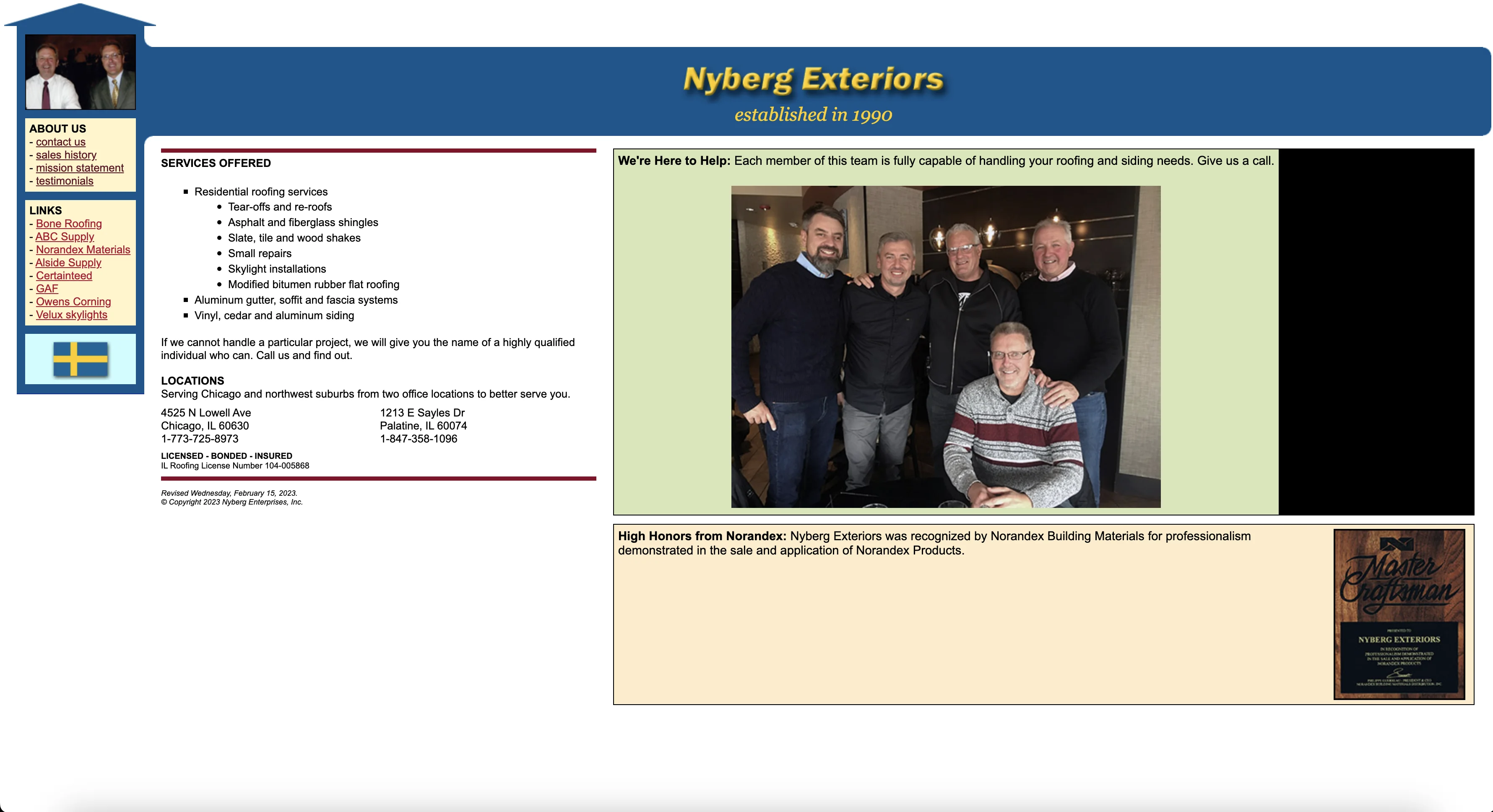
Nyberg Exteriors
A respectful audit of a strong Chicago roofing company whose website is leaving attention and revenue on the table.
How I Found Them
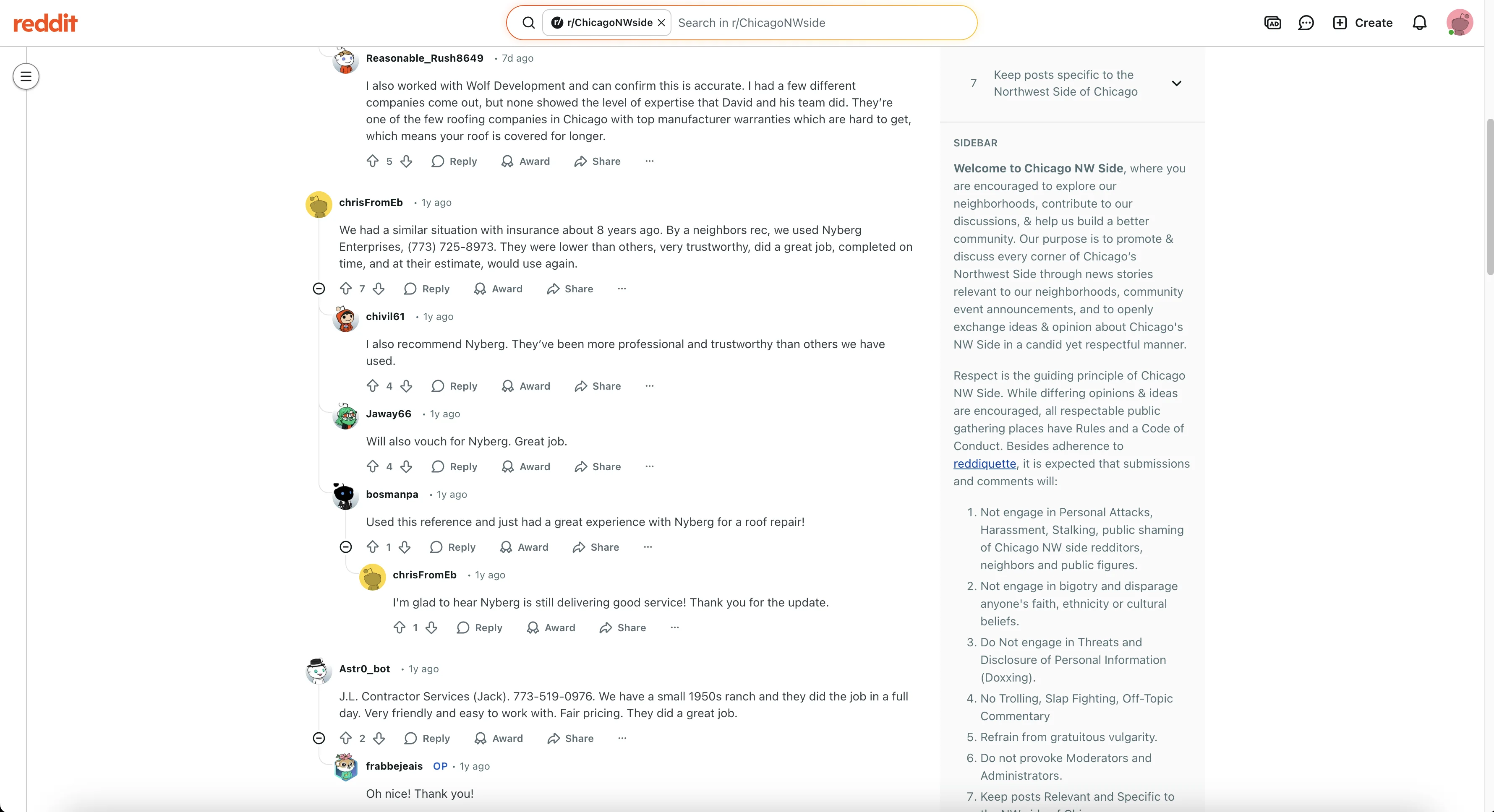
I found them the same way a lot of homeowners find contractors. I typed in “best roofers in Chicago,” and the first thing that came up was a Reddit thread with personal recommendations. When you read the replies from real homeowners, the praise is glowing. People clearly trust this company. This feels like a solid, honest, Midwestern business that does top-notch work.
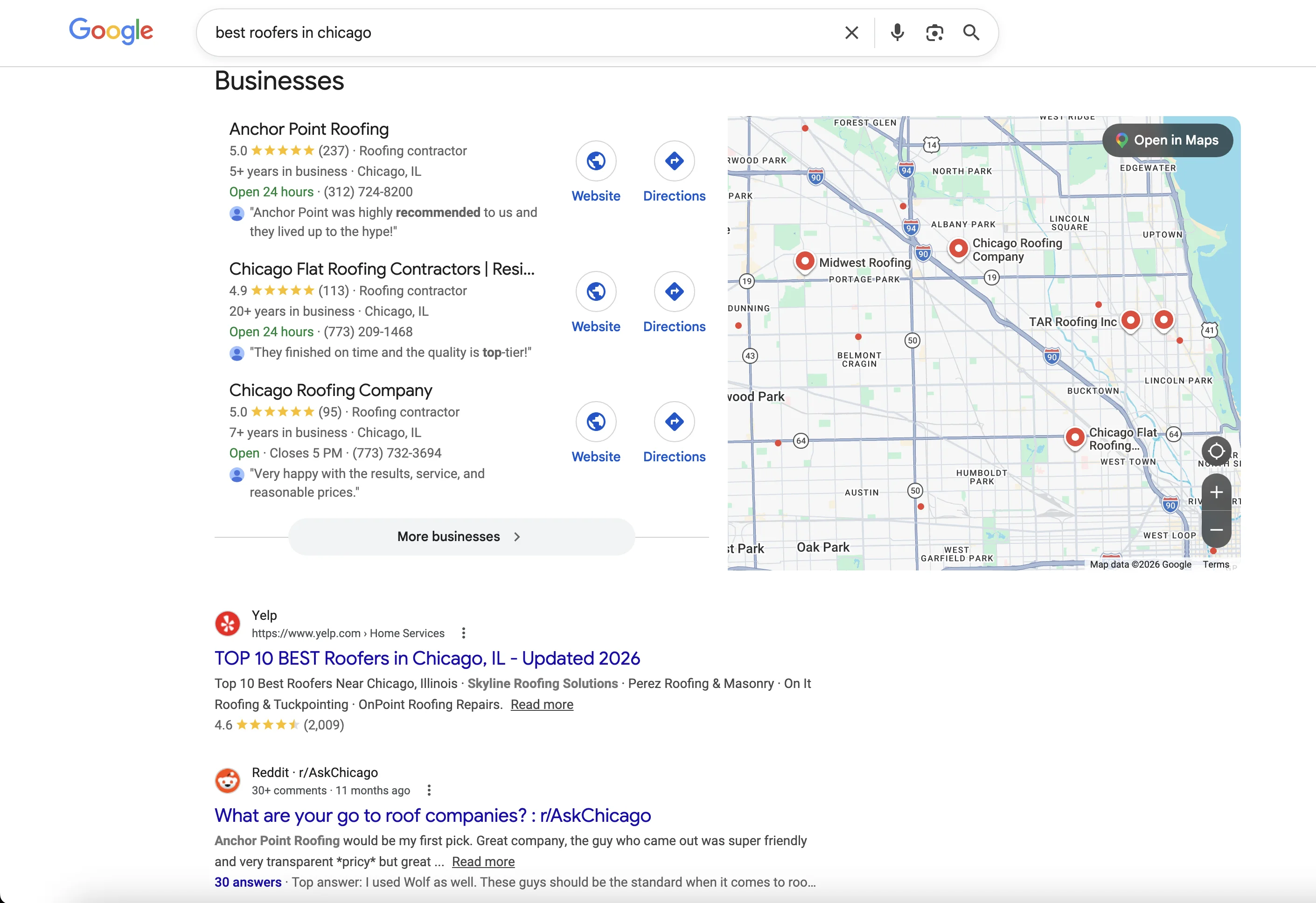
So when I land on their website, I expect to feel that same confidence right away.
And to their credit, some of that is there. You see the team photo. You see the message that they are here to help. You get the sense that these are real people who know what they’re doing.
But even in a quick audit, I can already see some major opportunities. There are strong trust signals here, strong work, strong customer satisfaction, and real history. The site and online presence just are not leveraging those strengths as well as they could.
So let’s do a rapid audit of the site and walk through what is already working, what I would improve, and how I would turn this into a stronger customer-acquisition machine. There are so many businesses like this all over the country. So many. Where a few tweaks and more customers are calling and buying.
What’s Already Working
First, there is a lot to like here.
The biggest strength is the business itself. This is clearly a company that has served real customers well and stands by them. You can see that in the outside recommendations, in the tone of the site, and especially in the testimonials and project photos.
A lot of businesses try to manufacture trust with polished branding, catchy animations, and cookie-cutter copy. Nyberg Exteriors already has the real thing.
Their sales history page is another strong one. That kind of long-term commitment says a lot to someone who’s looking for a major renovation. Their history should be featured far more prominently on the home page, because longevity and experience are one of the strongest trust signals a contractor can have.
Their testimonials are probably the biggest asset on the whole site. I mean, look at those homes and their roofs. The homes are stunning. The roofs look excellent. The proof is right there. Those visuals and customer stories should be front and center on the home page because they immediately answer the main question the homeowner is asking: can I trust these people with my house?
They also link out to suppliers and manufacturers, which is a good sign. That can help reinforce authority, especially when those relationships are worked naturally into service pages, educational content, and blogs. Hint: blog articles are still good for net information gain, which is what Google and the AI answers are looking for.
So the foundation here is strong. This is not a business with a trust problem at all. This is a business with a packaging and visibility problem.
Major Opportunities
Visual presentation
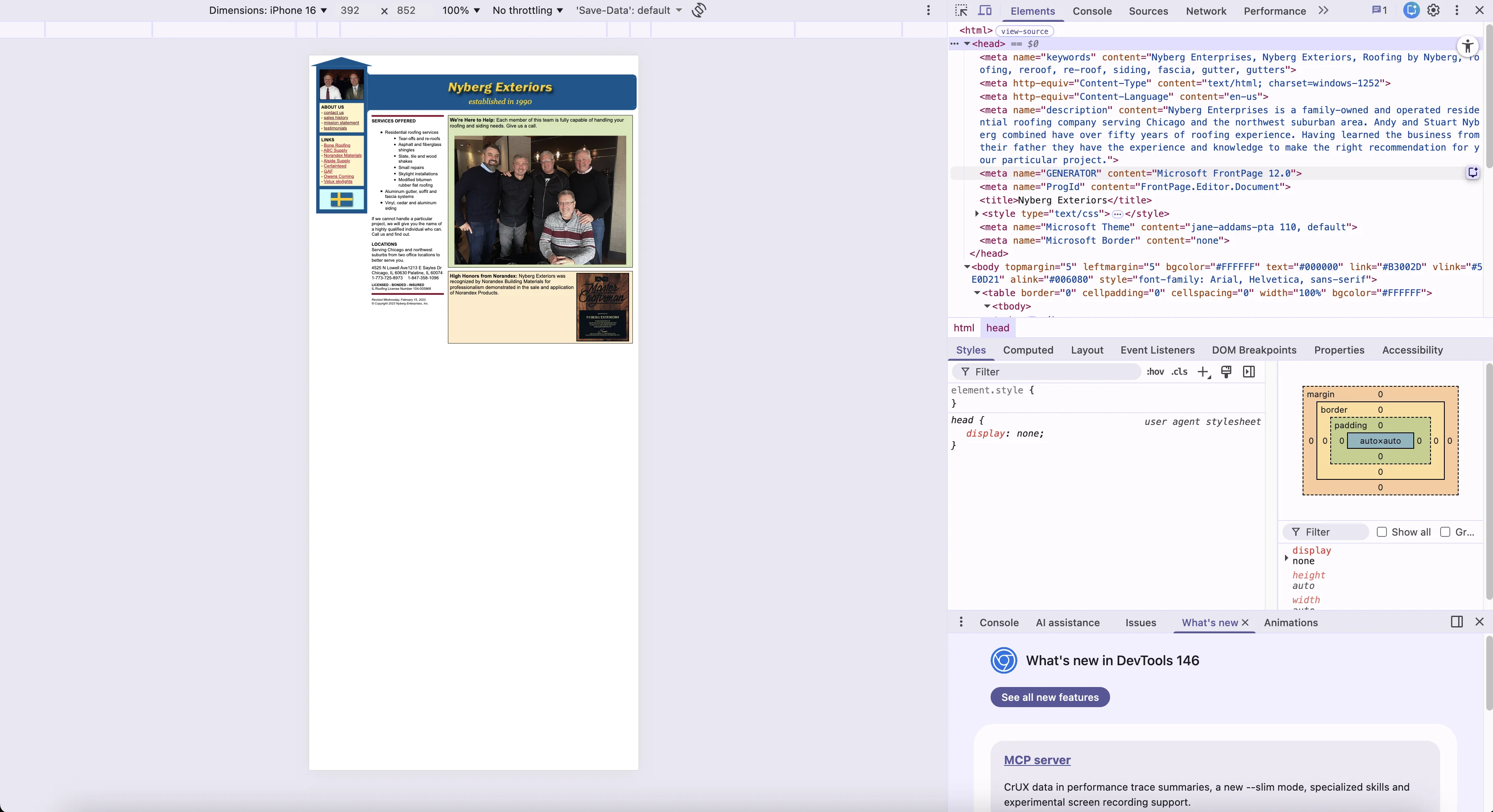
The site looks dated. It feels like it was built a long time ago and has not really been brought forward for the modern web. That does not mean the original work was bad. It just means the business has outgrown the presentation.
When the site looks old, people start making unfair assumptions about it. Are they still active? Are they keeping up? Maybe I should just keep looking. That is a problem when the actual company seems excellent.
There is also no favicon, which is a small detail, but details matter. It makes the site feel less complete and less polished.
The typography is consistent, which is good, but it could be stronger. Bolder headings, clearer hierarchy, and more visually confident text would make the site easier to scan and more persuasive.
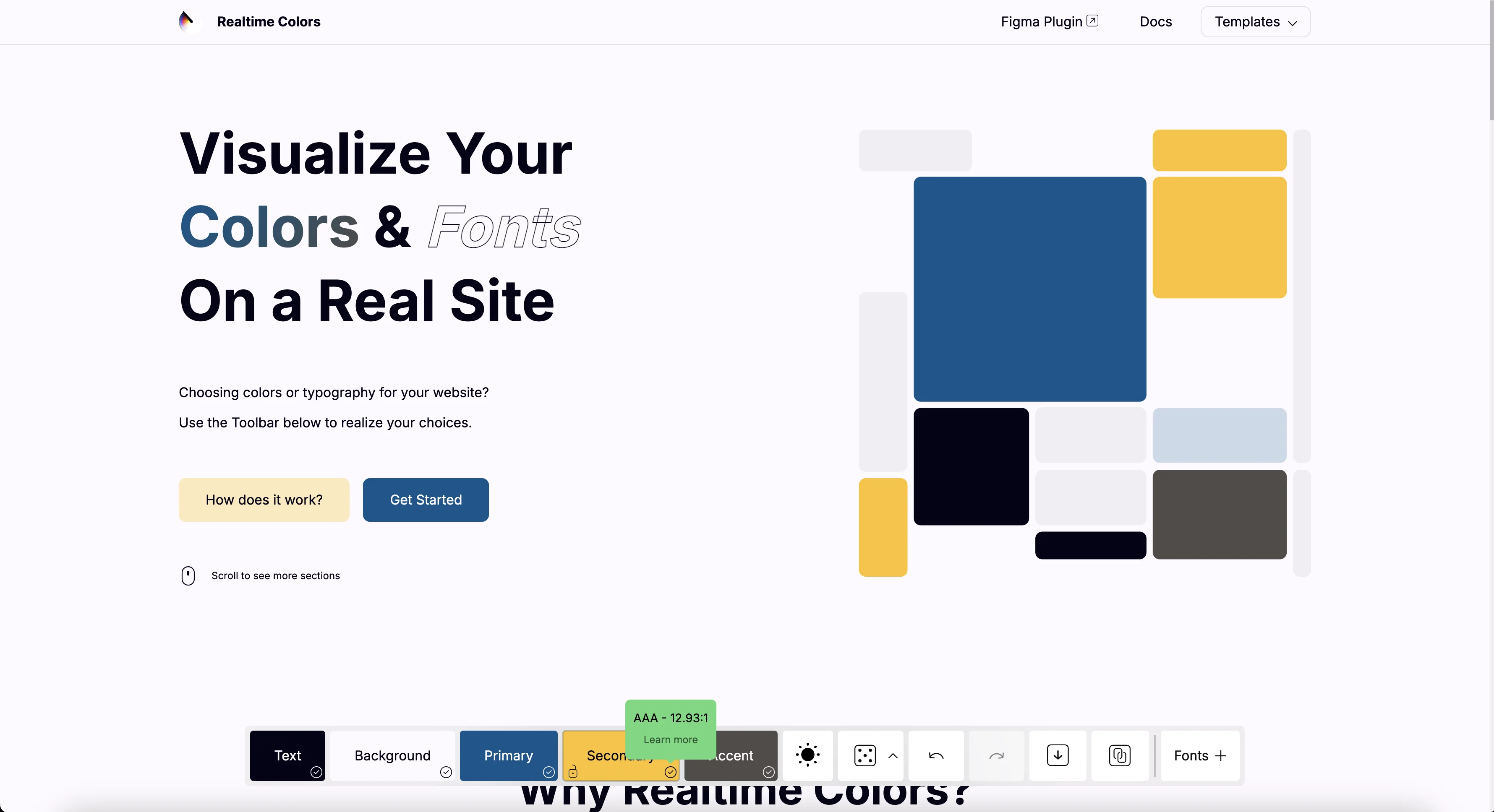
The color system could also be tightened. Right now it does not feel especially consistent or intentional. A more focused brand color palette could go a long way. Since this is a Chicago roofing company with Swedish roots, something like a blue, gold, and white system could create a cleaner, stronger identity if that fits their family history.
I generated a palette myself by taking the actual colors of the Swedish flag and paired them with complementary colors as an example. Background. Primary. Secondary. Accent for buttons. All are fully compliant with web accessibility standards.
Yeah, imagine a beautiful showcase roof right here from one of their happy customers. A roof coming out of the background. Bold text highlighting their experience. And then the picture of the crew right below. It would look so good.
Mobile usability
The next thing is mobile usability.
Right now it feels more like the desktop site has been scaled down. The text is small, the tap targets are small, and the whole thing is harder to use than it should be. That matters because a lot of homeowners are going to find this company on their phones while comparing options, asking for quotes, or checking reviews.
Fixing that is paramount.
Content structure and search visibility
Another major opportunity is content structure.
There should be dedicated pages for each major service. Separate pages for roofing, siding, repair, replacement, and any other core service would help both users and search engines understand exactly what the company offers and where its expertise lies.
Right now, there is not enough content depth or structure to send strong signals to Google or AI search systems.
Despite being praised by actual customers, they’re invisible in the eyes of Google and search engines. They’re not ranking on any pages for roofers in the area.
For a business this well regarded, I would expect stronger visibility in search. They are not showing up as prominently in Google as they should for a company with this kind of trust and reputation.
That is a huge opportunity.
There is a very real path to much stronger first-page visibility here with quality service-page targeting, stronger on-page SEO, structured data, higher-quality supporting content, better technical cleanup, and a more modern site architecture.
They should not only be aiming for better traditional search performance. They should also be positioning themselves for AI search results, summaries, and recommendation-style queries, because that is becoming a more important part of how people research local services.
Some pages also appear thin. There are missing heading opportunities, and the page titles could be much stronger. I would want to tighten up the H1s, add meaningful H2s, improve title tags, and make sure every important page has enough focused content to support ranking.
There also does not appear to be a blog or educational content hub. That is a missed opportunity. A company like this has the experience to publish genuinely useful articles about roofing problems, material options, storm damage, replacement timelines, pricing expectations, and maintenance. That kind of content can bring in organic traffic and help establish authority.
Technical SEO and performance
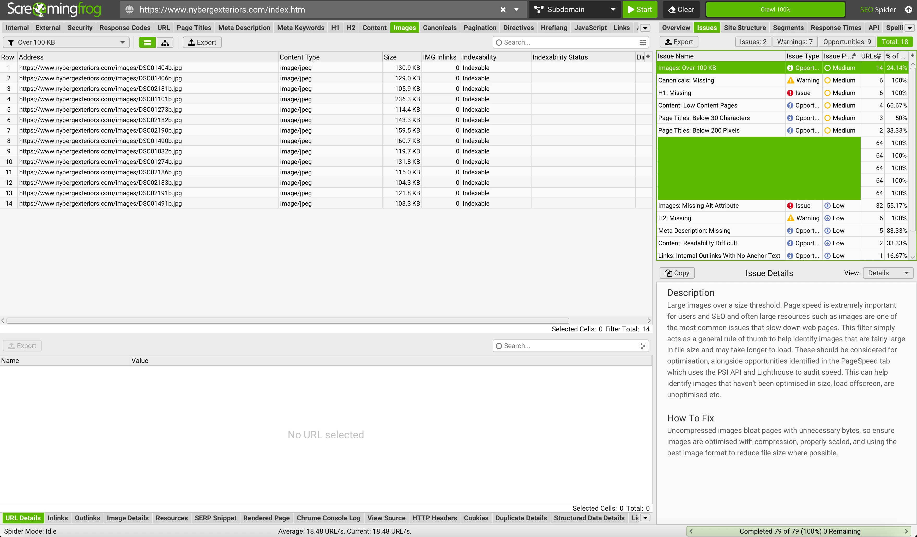
From a quick audit standpoint, there are several technical and SEO issues worth addressing.
Missing canonicals need to be fixed.
Page titles need to be optimized.
Some key heading structure appears to be missing.
There is no visible schema markup helping search engines understand the business.
There is no llms.txt file, which is a newer opportunity for guiding AI systems.
Image optimization could be improved. The site is using JPGs, which is fine, but in many cases modern WebP images would help with speed and efficiency.
Some images are over 100KB and could likely be compressed further without hurting quality.
All of this adds up. And none of these issues alone destroys a site, but together they make it harder to rank, harder to load quickly, and harder to stand out in both traditional and AI-powered search experiences.
Lead capture and conversion
The site also needs stronger lead capture.
There should be clear contact forms in the right places so interested homeowners can reach out immediately and so those leads can go straight into the business inbox for fast follow-up.
A stronger conversion setup could include multiple contact opportunities throughout the site, not just a basic contact page.
There is also room for something more strategic. For example, a custom roof-pricing or roof-checking widget could be a fantastic traffic and lead-generation tool. A tailored calculator or inspection estimator can pull in people who are searching for pricing or a rough budget range. That gets them on the site and considering Nyberg for their new roof.
That is exactly the kind of custom asset Excitify can build.
Freshness and platform age
One more thing that stands out to me is freshness.
The copyright year appears to stop at 2023, which can subtly signal that the site is not being actively maintained. That’s a quick, easy fix.
Again, no criticism of whoever built it originally. It may have served the business well for many years. It just looks like the site is ready for a modern update.
What I Would Do First
These solutions aren’t too difficult. If they hired me, I’d:
First, move the strongest testimonials, project images, and company history much higher on the home page. The trust is already there. It just needs to be made impossible to miss.
Second, I’d build out separate service pages with stronger titles, H1s, H2s, and localized content so the site can compete much better in search.
Third, I’d modernize the mobile experience and tighten the technical SEO foundation. Adding cleaner headings, schema, canonicals, image optimization, and better lead capture throughout the site.
They have the reputation. The history. Craftsmanship. Beautiful project results. The glowing posts from Reddit are from a year ago, so they’re still doing standout work.
They just need an online presence that showcases that.
Why This Matters
This is exactly why I wanted to use a business like Nyberg Exteriors as a sample audit.
There are so many amazing businesses across the country that have done the hard work of earning trust, building a reputation, and serving local people well, but their websites and online presence are still leaving revenue on the table.
A few tactical changes can make a huge difference.
Better visibility.
Stronger first impressions.
Cleaner lead capture.
More opportunities to be found in both Google and AI search.
Nyberg Exteriors already has the sauce. The next step is presentation, structure, and search visibility.
That is where Excitify comes in.
If you want this kind of experienced, respectful, conversion-focused audit for your own business, head over to the Rapid Revenue Audit page and let’s get started.